What size should a LinkedIn post image be?
LinkedIn allows a ratio range of 3:1 to 4:5, so 1080 by 1350 is not a recommendation, it is the tallest image the platform will accept without cropping.
- images
- specifications
- posts
What is the correct LinkedIn post image size?
Export at 1080 by 1350 pixels for a portrait image, or 1080 by 1080 for a square one. LinkedIn's own guidance recommends 1080 pixels of width, sets a minimum of 552 by 276, and allows an aspect ratio anywhere between 3:1 and 4:5, width to height. Images outside that range are cropped rather than rejected.
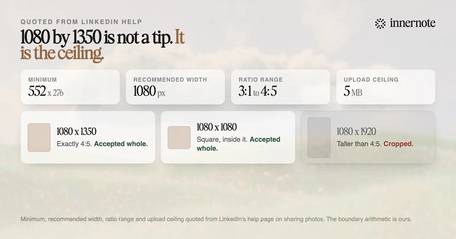
The arithmetic behind the popular number is the part that is never explained. A 4:5 ratio is 0.8, and 1080 divided by 1350 is exactly 0.8. So 1080 by 1350 is not a tip someone discovered by testing. It is the tallest portrait image LinkedIn accepts, sitting precisely on the published boundary, which is why it takes up the most vertical space on a phone.
LinkedIn's wording on what happens outside the range is specific: if the ratio is larger, the image will be centered and cropped to fit the max ratio. Nothing warns you, so a story-shaped export at 1080 by 1920 simply loses its top and bottom.
Why do the LinkedIn image size guides disagree with each other?
Because almost none of them are reading LinkedIn. The cheat sheets copy each other, so an error introduced once propagates for years. Two are easy to check against LinkedIn's own photo-sharing page: the upload ceiling and the accepted file formats.
- File size. The guides overwhelmingly say 3 MB. LinkedIn's help page on sharing photos states the size limit for an upload is 5 MB.
- File formats. The guides say PNG or JPEG only, attributed to LinkedIn. That page does not state an accepted format list at all, so the restriction has no published source.
- The minimum. Rarely quoted anywhere, despite being the number that decides whether a screenshot uploads cleanly. It is 552 by 276 pixels.
The pattern is the same one that produces the invented connection-request limits in LinkedIn's account restriction rules: a plausible number gets published once, it is repeated by people who assume the original checked, and eventually it is quoted back as though it came from the platform. Checking takes one click, which is precisely why nobody does it.
The practical consequence is small but real. Someone who believes the limit is 3 MB compresses a clean export until the text in it goes soft, for no reason. Someone who believes only PNG and JPEG work re-encodes a file that would have uploaded anyway.
Which image ratio actually performs best on LinkedIn?
Portrait, for a reason that has nothing to do with the algorithm. The feed is read mostly on phones, and a 4:5 image occupies more vertical space than a square or landscape one at the same width. More screen means more time before the image leaves the viewport, and dwell is part of what ranking optimises for.
That is a claim about geometry rather than a claim about favouritism, and the distinction matters. LinkedIn has never published a ranking preference for any aspect ratio, and a post claiming portrait images are boosted is inventing a mechanism. What is observable is that a taller image is on screen longer, and dwell time is a real ranking input.
Landscape is the one to avoid for anything with text on it. A wide image scaled to the width of a phone feed becomes a short strip, and the type inside it scales down with it. If your image carries words, portrait or square keeps them legible. If it is a photograph, the ratio matters much less.
One exception worth knowing: the preview image on a shared link is a different asset with a different shape, conventionally 1200 by 627, which is close to the 3:1 end of the range rather than the 4:5 end.
What about carousels, video and profile images?
They are separate specifications and the post-image numbers do not carry over. A carousel is a PDF upload rather than an image, video has its own dimensions and duration rules, and the two profile images sit in different boxes with different crops. Each has enough detail to be worth its own reference.
- Carousels are uploaded as a PDF, designed at 1080 by 1350, covered in the guide to [LinkedIn carousel posts](/blog/linkedin-carousel-post).
- Video has its own ratio and length guidance, in [the LinkedIn video guide](/blog/linkedin-video-2026).
- The profile banner is a wide, heavily cropped box with a real safe zone, covered in [the LinkedIn banner guide](/blog/linkedin-banner).
- The profile photo is square, cropped to a circle, and the framing rules are in [the profile photo guide](/blog/linkedin-profile-photo).
The one rule that does carry across all of them is to design at the size you are exporting rather than scaling up afterwards. An image enlarged from a smaller canvas arrives soft, and soft type is the single most common reason a otherwise good graphic reads as amateur in the feed.
Getting the pixels right is the easy half. The harder half is having something worth putting in the frame, week after week, in a voice that sounds like you rather than like a template. That is what innernote is built for, and you can check how a draft will look in the feed before you post it with the LinkedIn post preview tool.
Quick answers
Keep going