LinkedIn banner size in 2026 (and the part that gets covered up)
The official size is 1584 by 396. The useful part is knowing which third of it survives the profile photo, the intro card and the mobile crop.
- profile
- banner
- design
What size should a LinkedIn banner be?
1584 by 396 pixels, which is the size LinkedIn itself recommends. The file must be a JPG or PNG and under 8MB. That is the whole official specification, and following it exactly still produces a bad banner most of the time, because the rectangle is not what people see.
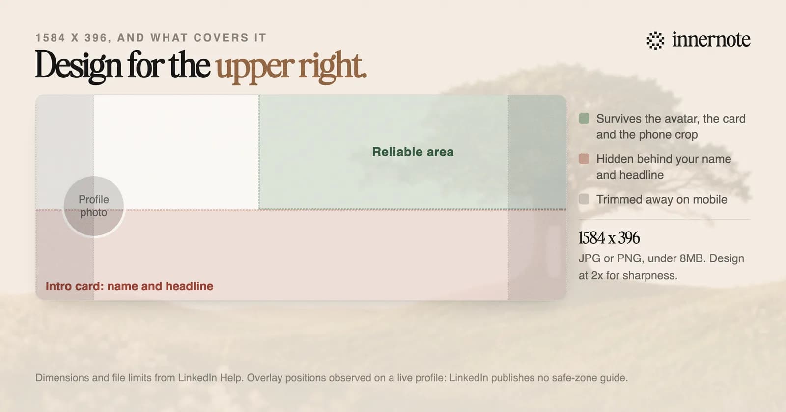
Three things sit on top of that rectangle. Your profile photo covers the lower left corner. The intro card, carrying your name and headline, covers the bottom band. And on a phone the sides are cropped in, so anything near the left or right edge disappears for most of your audience.
What survives all three is the upper right. Put anything that has to be read there, keep the lower left visually quiet, and assume the bottom third will be hidden. LinkedIn does not publish a safe-zone diagram, so treat this as an observation to check on your own profile rather than a documented rule.
Why does my LinkedIn banner look blurry?
Almost always because the source file is too small, and LinkedIn says so directly. Its help page tells you that if your cover image appears blurry or pixelated, choose an image with a larger file size. The compression happens after you upload, so it starts from whatever you gave it.
The practical fix is to design at twice the specification, 3168 by 792, and export at high quality. It scales down cleanly and gives the compressor room. Uploading a 400-pixel-wide image and hoping LinkedIn stretches it well is the most common version of this problem.
There is a second line on that page worth taking seriously, because it is unusually direct advice from a platform: photos will also look better than images with logos. Flat vector art and hard-edged type suffer most from re-compression. A photograph degrades gracefully; a thin logo on a flat background does not.
LinkedIn also notes the banner's appearance varies with browser window size and screen resolution. There is no single crop to design against, which is the real argument for keeping it simple.
What should you actually put on it?
One line that says what you do for whom, or nothing at all. The banner is the largest piece of real estate on your profile and the least read, so it works as reinforcement rather than as information. A visitor who cannot tell what you do after your headline will not be rescued by the picture above it.
- A single sentence of positioning. Not a slogan. The same plain phrasing that works in a headline works here, and the reasoning is in how to write a LinkedIn headline.
- Proof, if you have a specific piece. A named client logo set, a real number, a book cover, a stage photo from a talk you actually gave.
- Nothing. A clean photograph or a plain colour is a perfectly good answer and it never looks dated or broken on a small screen.
What to avoid is easier to list, because the same four mistakes account for most bad banners: text small enough to need zooming, anything important in the bottom third, a wall of stock imagery with a motivational quote on it, and contact details, which are already on your profile and which age badly.
One thing worth knowing before you spend an afternoon on it. Your banner does not affect whether anyone finds you. Discovery runs through your headline, About section and posts, which is what LinkedIn's search system reads, covered in how to show up in LinkedIn search in 2026. The banner only works on people who already arrived.
How do you make one?
Any design tool that lets you set an exact canvas size will do it. Canva is the common choice because it has LinkedIn banner templates at the right dimensions already, but Figma, Keynote or Photoshop are all fine if you set 1584 by 396 yourself and export a JPG or PNG.
Two checks before you upload. Preview it on your phone, not just on a laptop, because that is where the sides get cropped and where the type gets small. And look at it with your profile photo in place rather than in the design tool, since the design tool has no idea an avatar is about to sit on your carefully centred text.
If a template already looks close to right, use it. There is no advantage to a bespoke banner and there is a real cost to a badly made one, which is why the best answer for most people is a decent photograph and a single line of text.
The banner is the smallest lever on your profile, and it is worth exactly one afternoon. The photo beside it is worth slightly more and has actual research behind it, in what makes a good LinkedIn profile photo. What changes whether a visit turns into a follow is what the profile says and whether your posts sound like the same person who wrote it. That is the part innernote handles: it learns how you actually describe your work, so the headline, the About section and the posts underneath all read as one person rather than three.
Quick answers
Keep going