How to make a LinkedIn carousel post (and the specs that actually matter)
LinkedIn carousels are document posts wearing a different name. The real file limits, the size to design at, how to build one, and what belongs on each slide.
- carousel
- formats
- how to
What is a LinkedIn carousel in 2026?
A document post. LinkedIn retired its dedicated carousel feature years ago, so what everybody now calls a carousel is a multi-page file uploaded through the document option, which the feed then renders as a swipeable deck. There is no carousel button to look for.
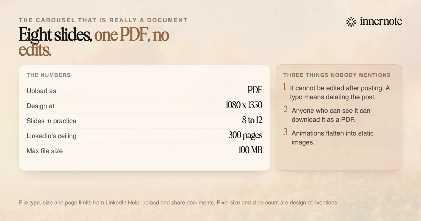
LinkedIn's own help page sets the limits, and they are more generous than most guides claim. The accepted file types are PPT, PPTX, DOC, DOCX and PDF, and in LinkedIn's words the file size cannot exceed 100MB and 300 pages.
Two behaviours on that page matter more than the limits and almost nobody mentions them.
- You cannot fix it later. LinkedIn states you can edit the description or remove the post, but you cannot change or edit the document in the post. A typo on slide four means deleting the post and losing its engagement.
- Anyone who can see it can keep it. LinkedIn states that for accessibility, members who can view your post can download your document as a PDF. That makes a carousel a free lead magnet, and it also means never putting anything in one you would mind being circulated.
- Animations do not survive. Videos and other animations in documents display as static images, so a deck built in Keynote with builds will flatten.
The download behaviour is the underrated part. A carousel is the only feed format that a reader can save to their desktop and send to a colleague a month later.
What size should a LinkedIn carousel be?
Design at 1080 by 1350 pixels, which is portrait at a 4:5 ratio, and keep it to somewhere between eight and twelve slides. Portrait wins for the same reason it wins for video: it takes up more of a phone screen, and the feed is mostly read on a phone.
Square at 1080 by 1080 also works and is worth using if the same deck is going to Instagram. What does not work well is landscape, which shrinks to a letterbox strip on a phone and takes the text with it.
Upload as PDF even though LinkedIn accepts Office formats. PDF renders identically everywhere, embeds the fonts, and cannot reflow, which matters because a document that reflows on someone else's device is a document with text falling off the slide.
On length, the 300-page limit is a ceiling and not a target. Every slide after the first is a swipe you have to earn, and the swipes are what the ranking system reads as interest. Eight to twelve is enough to develop one idea properly and short enough that people reach the end.
How do you actually make one?
Build the slides in any design tool, export a PDF, and upload it through the document option on the post composer. Canva is the common choice because it has LinkedIn carousel templates at the right dimensions, but Figma, Google Slides and Keynote all do the job if you set the page size yourself.
The step that trips people up is the export. In Canva the option you want is share, then download, then PDF standard. Exporting as PNG gives you a folder of images, which uploads as a multi-image post instead, and a multi-image post is a different format with different behaviour.
One practical warning about templates. A free Canva account cannot use any template marked with a crown, so pick from the unmarked ones before you spend an hour on a design you cannot export cleanly.
Check the caption before you publish. The text above a document post is still what most people read first and it still truncates at around 140 characters in the feed. Both are easy to check in the LinkedIn post preview tool, and the exact cut-off points are in every LinkedIn character limit in 2026. If you are posting a single image rather than a deck, the specification is different and is covered in what size a LinkedIn post image should be.
What goes on the slides?
One idea per slide, in the order you would explain it to someone who asked. The most common failure is a carousel that is a blog post cut into pieces, which reads as work rather than as a swipe, and gets abandoned around slide three.
- 1.Slide one is the promise, and it is doing the job of a headline. Make it a specific claim rather than a topic label.
- 2.Slides two to ten are one point each, with enough white space that the text is readable at thumbnail size.
- 3.Put something concrete on most slides: a number, a screenshot, a before and after. A deck of assertions is the visual version of a generic post.
- 4.The last slide asks for one thing. Follow, comment, or save. Not three things.
- 5.Repeat the promise in the caption. Many people never swipe, and the caption is the part they read.
It is worth knowing how much upside the format has. In Metricool's 2026 study of 670,000 posts, carousels generated up to 17 times more interactions than a single image, while images made up roughly half of everything posted and carousels stayed rare. That combination, high performance and low supply, is unusual and it does not tend to last.
The reason carousels stay rare is that they are more work than a text post, and the work is mostly in deciding what the ten points are. If getting that out of your head is the bottleneck rather than the design, that is the part innernote handles: it turns a rough thought or a voice note into structured points in your own voice, which is the outline a carousel needs before anyone opens a design tool.
Quick answers
Keep going