Most LinkedIn engagement benchmarks fail their own arithmetic
The format stats everyone quotes contradict themselves inside a single article. Here is the arithmetic, why it happens, and which numbers are worth keeping.
- engagement
- benchmarks
- data
What is wrong with LinkedIn engagement benchmarks?
Many of them contradict themselves. The same article will publish a table of engagement rates by format and then, a few paragraphs later, quote a multiplier comparing those formats that is impossible given its own table. You do not need a data set to catch it. You need a calculator.
Take the most repeated set of format figures from 2026 round-ups: document and carousel posts at 7.00% engagement, multi-image at 6.45%, video at 6.00%, polls at 4.40%, text-only at about 4.00%. Those specific numbers appear across a lot of articles.
Now take the multipliers that appear alongside them, often on the same page: that carousels get 278% more engagement than video, 303% more than image posts, and 596% more than text-only.
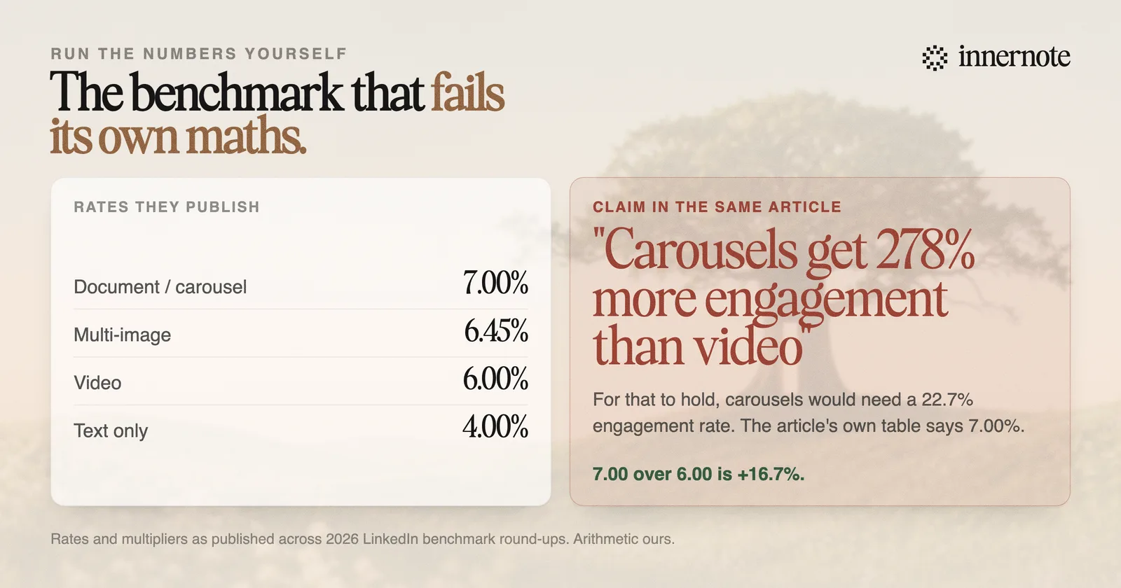
7.00 against 6.00 is an increase of 16.7%. For carousels to get 278% more engagement than video at a 6.00% video rate, carousels would need an engagement rate of 22.68%. The article's own table says 7.00%. Against text-only at 4.00%, carousels are 75% higher, not 596% higher, which would require a rate of 27.84%.
Both numbers cannot be true. Either the rates are wrong or the multipliers are, and no article publishing both has ever said which.
How does this happen?
Not usually by anyone inventing a number. It happens through copying. A figure is lifted from one article, its context is dropped, a second article rounds it, a third pairs it with a table from somewhere else entirely, and by the fifth nobody can trace either number back.
- Different baselines get merged. A multiplier calculated against a subset, or against reach rather than engagement rate, gets printed beside rates calculated a different way.
- Percentage points and percentages get confused. Going from 4% to 7% is three percentage points, a 75% increase, or 1.75 times, and those get swapped freely.
- Sample definitions vanish. A rate from a sample of high-performing accounts is not comparable to one from all accounts, but the qualifier is the first thing cut for length.
- Nobody checks, because checking is not rewarded. A round-up with bigger multipliers is more shareable than one with accurate ones.
The same laundering happens with algorithm claims. A widely quoted LinkedIn ranking paper was withdrawn by its own authors in February 2026, and the blog summaries built on it are all still up, still being cited.
Which LinkedIn numbers can you actually trust?
Sort every statistic you meet into three tiers by who produced it and how. The tier tells you how much weight it can carry, and most content marketing quotes tier three as though it were tier one.
- 1.Published by LinkedIn about its own systems. The arXiv papers and the engineering blog. These describe architecture and report A/B results, and they are the only tier where the platform is describing itself.
- 2.Large independent samples with a stated method. Work like the Algorithm Insights report, which sampled roughly 1.8 million posts across about 400,000 profiles. Good for direction and rough magnitude, weaker on any single figure.
- 3.Vendor and round-up statistics with no stated sample. Most format benchmarks live here. Treat as illustration, never as evidence, and never quote them in a deck.
A useful habit: before repeating a statistic, try to name the sample. How many posts, over what period, from what kind of accounts? If you cannot answer from the article, the article does not know either.
So does post format matter at all?
Less than the multipliers suggest and more than nothing. Take the published rates at face value and the real spread across formats is roughly 4% to 7%, which is meaningful but nowhere near the several-hundred-percent gaps in the headlines.
There is also a plausible mechanism behind the format that consistently comes top. Document posts take longer to consume, because you swipe through slides rather than reading a paragraph, and time on the post is an explicit ranking objective. That connection is covered in dwell time, the metric you cannot see.
But the direction of causation deserves the same scepticism we applied to the arithmetic. People generally make a carousel when they have something substantial to say and are willing to spend an hour on it. Some of what looks like a format effect is really an effort effect wearing a format's clothes.
Turning a thin text post into a thin ten-slide carousel does not buy you the carousel's engagement rate. It buys you a thin post that took longer to make.
What should you do instead of chasing benchmarks?
Benchmark against yourself. Your own last twenty posts are a better comparison set than any published average, because they hold constant everything a published average cannot: your audience, your topic, your network and your credibility. The same rate-versus-count confusion is what makes polls look dead, worked through in are LinkedIn polls dead, and the reason no two published rates are comparable at all is in how to calculate LinkedIn engagement rate.
- 1.Track engagement rate against impressions on your own posts rather than counting reactions, which scale with audience size and say little about whether a post worked.
- 2.Compare like with like. A Tuesday morning post about your specialism against other Tuesday morning posts about your specialism.
- 3.Look at your top three posts of the quarter and ask what they share. That is your actual benchmark, and it is specific to you.
- 4.Change one thing at a time. If you switch format, length and topic together, you have learned nothing about any of them.
- 5.Give it a proper window. Post-level variance is enormous, so a fortnight of data will mislead you in whichever direction it happens to point.
This is slower than reading a benchmark table and much more useful, because it measures the only thing that pays: what works for your audience rather than for the average of everybody's. The same problem shows up in posting-time advice, where three large 2026 studies reach three different answers: is there a best time to post on LinkedIn.
And the input that moves those numbers most is not format, it is whether the post sounds like a person with something to say. That is the part innernote is built for: it learns how you actually talk, then drafts from your own stories and opinions rather than the internet's average take. Free trial, no card needed.
Quick answers
Keep going