Should you use bold text on LinkedIn? What it actually costs
Bold on LinkedIn is not a font, it is a different alphabet. That one fact explains why styled text costs double the characters and cannot be searched.
- formatting
- accessibility
- posts
How do you make text bold on LinkedIn?
You do not, strictly speaking. LinkedIn posts have no bold or italic control, so every formatter works the same way: it swaps each letter for a different character that happens to look bold. You paste the result in, and LinkedIn stores it as ordinary text, because that is exactly what it is.
The substitutes come from a Unicode block called Mathematical Alphanumeric Symbols, added so that mathematicians could write a bold vector and an italic variable as distinct symbols rather than as styling. A plain lowercase b is codepoint U+0062. The bold-looking one is U+1D41B, formally named mathematical bold small b. They are no more the same character than b and beta.
This is the fact the rest of the article follows from. Styled text on LinkedIn is not formatting applied to your words. It is a different set of letters that resemble yours.
Because they are real characters rather than markup, they survive everywhere plain text survives: posts, comments, headlines, messages. That reliability is the whole appeal, and it is also the source of every problem below.
What does styled text cost you?
Three things, all of them consequences of the same substitution. Styled letters consume twice the character budget, they are invisible to exact-match search, and assistive technology cannot reliably recover the words you meant. None of these is a penalty LinkedIn applies, which is why none of them is documented anywhere.
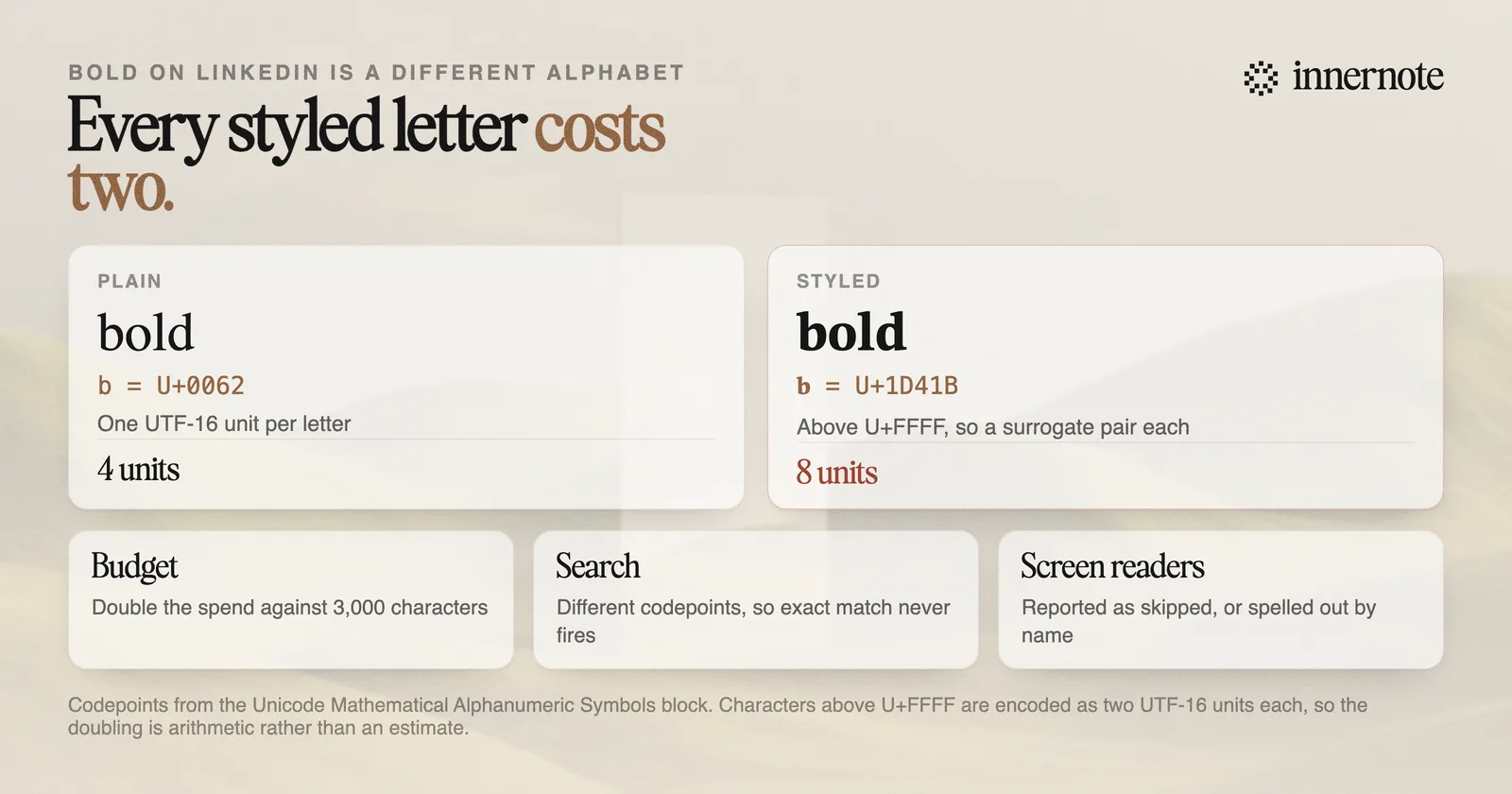
The character cost is the one you can verify in ten seconds. Mathematical Alphanumeric Symbols sit above U+FFFF, outside the range a single UTF-16 unit can hold, so each one is stored as a surrogate pair of two units. The word bold is four units in plain text and eight in bold, so a styled heading eats twice the room against the 3,000 character post limit.
The search cost follows just as directly. A search for a word matches the codepoints of that word. Styled text is made of different codepoints, so it does not match, and a keyword you styled for emphasis is a keyword you removed from every index that looks for it. Styling the one term you most want to be found for is the common and expensive version of this mistake.
The accessibility cost is real but worth describing precisely, because the popular version overstates what has been demonstrated. Reported behaviour varies by screen reader: one published demonstration by the designer Per Axbom shows the reader passing over the styled words in silence, while other accounts describe each character being announced by its Unicode name. Either way the sentence does not arrive as written.
Does bold text hurt your LinkedIn reach?
There is no published evidence that LinkedIn demotes posts for using styled characters, and anyone telling you it does is inventing a mechanism. What can be said from the encoding is narrower and more useful: styled words drop out of search matching, which affects discovery rather than feed distribution.
That distinction is worth holding, because the two get blurred constantly. Feed distribution is what decides whether your followers see a post today. Search matching is what decides whether anyone finds it in six months, or finds your profile by the term you want to own. Styling affects the second and has no demonstrated effect on the first.
The indirect argument is more plausible than the direct one. A post covered in bold, italic and script tends to read as decorated rather than considered, and the first two lines are doing the real work of earning a read. If styling is compensating for an opening that is not strong enough, the styling is not the fix. The hook is.
A useful test: if the bold were removed, would the line still be worth reading? If the answer is no, the problem was never the formatting.
When is it worth using anyway?
Sparingly, and for structure rather than emphasis. One styled line acting as a heading inside a long post is a reasonable trade: it costs a few characters and helps a reader scan. A post with bold scattered through every paragraph pays all three costs repeatedly and gains nothing, because emphasis everywhere is emphasis nowhere.
- Reasonable: one short styled line as a section marker in a long post, where the words themselves are not the terms you want found.
- Reasonable: a styled character used as a bullet or divider, which carries no meaning to lose.
- Avoid: styling your own name, your job title, your company, or any keyword you want to be searchable.
- Avoid: styling in your headline or About section, which are the surfaces most often reached through search in the first place.
The last one catches people out most. A headline is one of the most searched surfaces on the platform, so a styled headline is the single worst place to spend this trade. If you want the headline to stand out, the lever is the wording, covered in the guide to LinkedIn headlines, not the character set.
If you do want a styled line, the LinkedIn text formatter will generate one and you can check the real length against the limit with the character counter. Just be clear that formatting is the last five percent. The reason a post gets read is that it sounds like a person with something specific to say, which is the part innernote actually helps with. Free trial, no card needed.
Quick answers
Keep going